
Little Lotto is a fantastic way to help us and you might WIN as well.
Ups and Downs Southwest is a Down Syndrome support charity serving children and young people, their parents/carers and all linked professionals dealing with the health and education of children and young people who have Down Syndrome.
Somerset Office
Our head office is based in Somerset and from here we cover, Devon, Dorset, Somerset, North Somerset and Wiltshire.
Bristol Office
For families and professionals in the Bristol area, we have a dedicated team based at The Park Centre, Knowle.

Right Pear Take on the Bristol Half
Right Pear Take on the Bristol Half for Ups and Downs SouthwestAn inspiring Charity of the Year partnership in action We are incredibly grateful to Jonny and Giles of Right Pear for their fantastic support as part of their Charity of the Year partnership with Ups and...
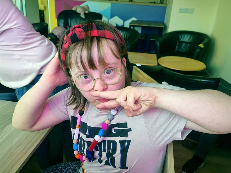
Sensory Jewellery WsM Youth Club
Sensory Jewellery Fun at Weston super Mare Youth Club! We had a fantastic time getting creative at Weston Youth Club with a sensory jewellery-making session full of colour, conversation, and connection. It was a pleasure to welcome Abbi Lee from Oojamabobs, who led...
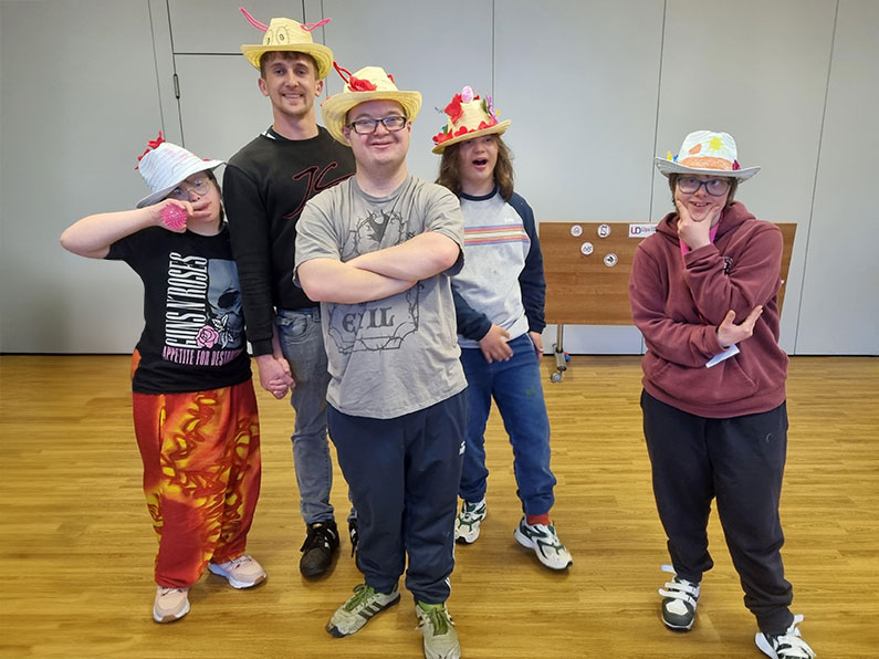
Easter Fun at WsM Youth Club
We had an Eggs’tra special time at Weston-super-Mare Youth Club this Tuesday The energy was buzzing, the creativity flowing, and the Easter vibes were in full swing! Kicking off the session, we got hands-on with Makaton, learning the signs for Easter, eggs, and, of...
Support from the Foyle Foundation
Support from The Foyle Foundation | We are incredibly grateful at Ups and Downs Southwest for the generous grant

Little Lotto Winners March 2025
Congratulations to our Little Lotto Winners March 2025 Well done to our latest winners in the Ups and Downs Southwest Little Lotto 50/50 Club. You could be in for a chance of winning in the next draw by signing up below.
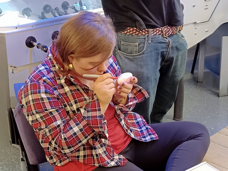
Easter Egg Art
Easter Egg Art and Song at Sherborne Youth Club At Sherborne Youth Club, we recently enjoyed a vibrant, engaging evening filled with creativity and music. Our Easter-themed session began with a hands-on egg painting activity, encouraging our young members to express...
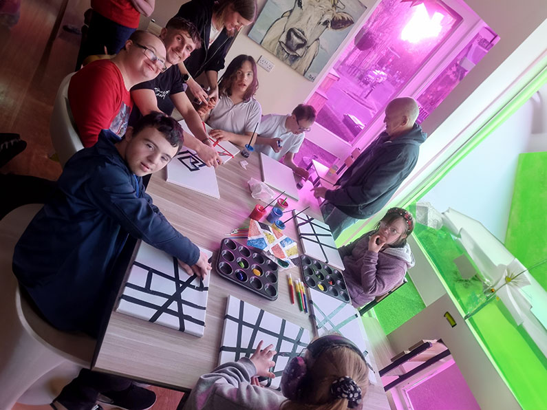
Abstract Canvasses
The young people at Weston-super-Mare Youth Club had an unforgettable time unleashing their creativity through abstract art. The session was alive with energy as they explored different artistic techniques, transforming blank canvases into vibrant masterpieces. Using...

Little Lotto Winners February 2025
Congratulations to our Little Lotto Winners February 2025 Well done to our latest winners in the Ups and Downs Southwest Little Lotto 50/50 Club. You could be in for a chance of winning in the next draw by signing up below.
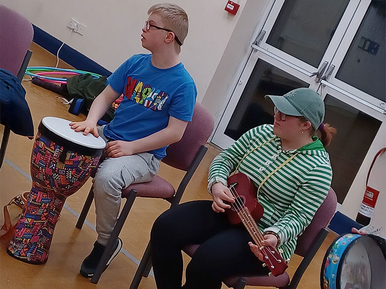
Evolve Music Session
We had an incredible experience during the Evolve Music Session at Sherborne Youth Club, which left everyone buzzing with excitement! The atmosphere was vibrant and pulsating with energy, creativity, and collaboration. As they performed, it was amazing to witness the...

Five More Years of Funding for Bristol Service
Further Funding Success – National Lottery Awards for All. This award is for our amazing Volunteer Befriender Program adding to our family support services.
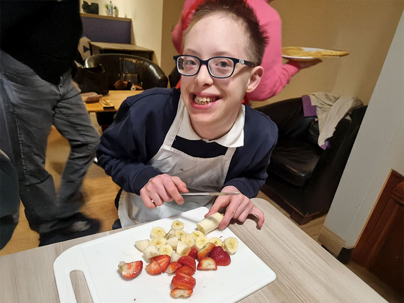
Pancakes Flipping Good Time
We had a 'flipping' good time making pancakes at WsM youth club. Young people measured, chopped, and mixed their own ingredients. They even did a cracking job adding the eggs! Young people helped set up and tidy the space; they even helped wash their plates,...

Little Lotto Winners January 2025
Congratulations to our Little Lotto Winners January 2025 Well done to our latest winners in the Ups and Downs Southwest Little Lotto 50/50 Club. You could be in for a chance of winning in the next draw by signing up below.
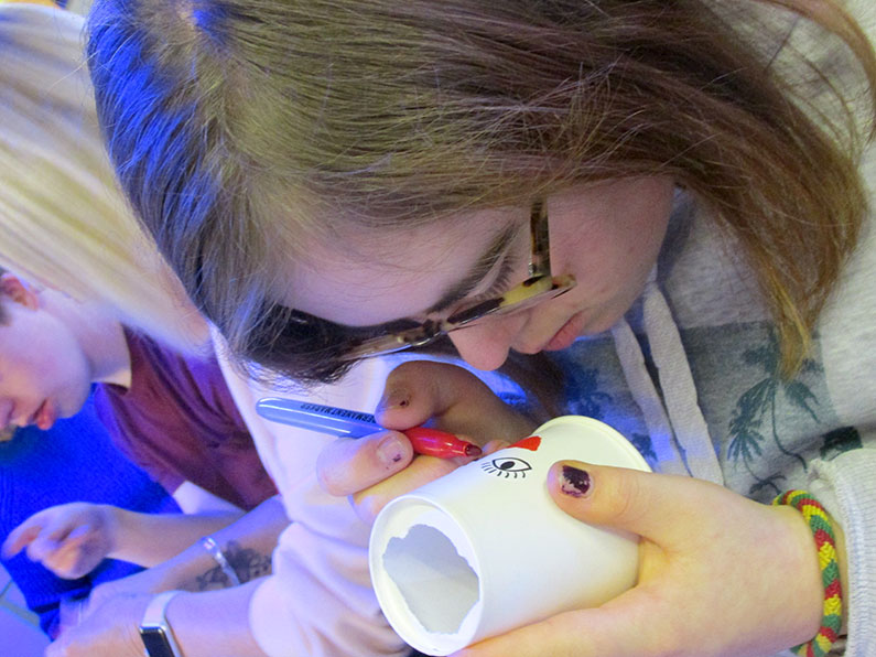
Ball Launcher and Fruit
At Sherborne Youth Club, our ball launcher activity was absolutely brilliant. The session kicked off with the youth diving into the creative process of designing their very own ball launchers. Armed with an assortment of materials and their imaginative ideas, they...

Little Lotto Winners December 2024
Congratulations to our Little Lotto Winners December 2024 Well done to our latest winners in the Ups and Downs Southwest Little Lotto 50/50 Club. You could be in for a chance of winning in the next draw by signing up below.
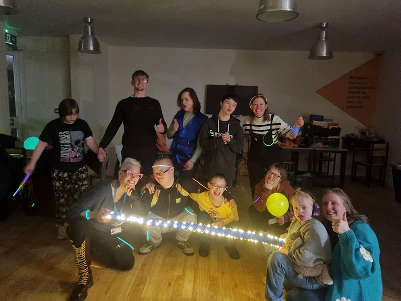
UV Glow and Groove
We had an absolutely thrilling time at our UV dance and fitness session at Ups and Downs Southwest’s Weston-super-Mare Youth Club! The atmosphere was electric, filled with vibrant energy and excitement. From the dazzling display of glowing sensory balls flying...
Events What’s On

Music and Singing Night
Weston-super-Mare Youth Club
Weston-Super-Mare Youth Club – Music & Singing Night!
Date: Tuesday 20th May 2025
Time: 6:00–8:00 pm
Location: YMCA, 2 Bristol Road Lower, Weston-Super-Mare, BS23 2PN
Calling all young people aged 10–25 – get ready for a fun-filled, feel-good evening at Weston-Super-Mare Youth Club!
This time, it’s all about music, singing, and signing – and we’ve got a brilliant line-up to help you find your rhythm and raise your voice!
Gemma will be running an interactive voice and percussion session – a great way to experiment with sound, express yourself, and make music together.
Nikki, our fabulous Makaton tutor, will lead a singing and sign-along session, teaching some uplifting songs using Makaton signing.
And if you’re feeling brave, grab the mic for a bit of karaoke fun – solo, duet or group… It’s your time to shine!
No experience needed – bring your energy and enthusiasm. Let your voices be heard – we can’t wait to sing and sign with you!

"*" indicates required fields

Coffee, Cake and Chat!
The Silver Otter, Devon
New to Devon: Coffee, Cake, and Chat!
We are absolutely delighted to invite you to our new **bi-monthly Coffee, Cake, and Chat sessions in the heart of Devon**! Whether you’re new to the area or simply looking for a friendly space to connect, these informal gatherings are the perfect way to meet other families, enjoy a delicious treat, and access advice from our dedicated family support team—all in a relaxed and welcoming environment.
Where:
The Silver Otter Café, 15 Silver Street, Ottery St Mary, Devon, EX11 1DB
When:
these are to be held on the following dates at 10:00 AM – 12:00 PM
- 18th September 2024
- 27th November 2024
- 29th January 2025
- 26th March 2025
- 21st May 2025
- 16th July 2025
(Our family support team will be available until 2:00 PM for additional advice, guidance, or a one-to-one chat.)
Who’s Invited?
Everyone! Whether you’re a parent, caregiver, or someone who just loves a good cup of coffee and conversation, you’re welcome to join. It’s a family-friendly event, and we encourage people of all ages to attend.
Why Attend?
These sessions are designed to offer a warm and supportive space where you can:
- Meet and connect with other families in the area
- Relax** over a cup of coffee or tea, and sample some delicious cake
- Share your experiences, challenges, or simply enjoy a chat
- Access support from our family support worker, who can provide advice on a range of topics including family life, education, and community resources
Venue:
The Silver Otter Café is part of the Able2achieve Trust, a wonderful local initiative that supports individuals with learning disabilities, mental health challenges, and other associated needs. With its cozy atmosphere and community-minded mission, it’s the perfect setting for our gatherings. Whether you’re here to unwind or seek advice, you’ll feel right at home.
Parking:
Convenient on-street parking is available nearby, and there’s a public car park just a short walk away on Brook Street, making it easy for you to pop in and join us.
How to Reserve Your Spot:
To help us prepare for a fantastic morning, we kindly ask that you complete the simple booking form below to let us know you’re coming. This ensures we have enough coffee, cake, and comfy seats for everyone!
We can’t wait to welcome you—come along, bring a friend, and make yourself at home. We’re here to listen, chat, and offer a helping hand where needed. See you at the next Coffee, Cake, and Chat!
"*" indicates required fields

Bowling Trip
We’re heading out for a memorable Youth Club trip to the Hollywood Bowl in Yeovil!
Join us for a fun evening where we’ll enjoy a game of ten-pin bowling, followed by time to sit together and enjoy a snack and a drink. It’s the perfect chance to have fun, relax, and socialise with friends in a different setting!
Important: Spaces must be booked in advance!
Parents/carers need to:
- Complete the booking form
- Pay the £5 subs online
- Booking deadline: Thursday, 15th May
Don’t miss out – secure your space early and get ready for a fantastic night of bowling fun!

The cut off date for this event was the 15th May 2025 at Noon

Bingo and Baking
Bristol Youth Club
Get ready for an epic day filled with laughter, creativity, and memories! How about gathering your buddies for an absolutely thrilling baking session? Imagine the sweet aroma wafting through the air as you dive into making a scrumptious batch Roll up those sleeves, grab your mixing bowls, and let the fun begin!
But wait, the excitement doesn’t stop there! Once you’ve satisfied your sweet tooth, it’s time to crank up the adrenaline with an exhilarating round of Bingo! Who knows, you could be the lucky one walking away with some fabulous prizes!
And the fun keeps rolling! After the games, there’ll be plenty of time to chill with your friends, swap stories, and dive into even more games. It’s the perfect way to relax and enjoy each other’s company!
This is not just any ordinary get-together; it’s a session packed with delicious treats, thrilling games, and unforgettable moments.
Don’t miss out on this amazing adventure—join in on the fun and make it an evening to remember!

"*" indicates required fields

Frome Coffee Morning
Cheese and Grain, Frome
We are thrilled to announce that this year, our coffee mornings will be hosted at various venues. Our second venue is the Cheese and Grain in Frome.
The Cheese and Grain is a not-for-profit, member owned social enterprise and also a registered charity. Its main aim is to promote and boost Frome’s social, cultural and economic life. The Cheese and Grain has an important role in Frome because they can host meetings, large (with a capacity of 835 standing and 500 seated) and small (up to about 30 people in their mezzanine). The lovely café is located in the centre of The Cheese and Grain and is the perfect space to come and and enjoy a tasty smooth coffee and maybe a slice of cake too!
Join Michelle Bull at The Cheese and Grain on October 10th from 10 am to 12 pm for a wonderful morning of coffee, conversation, and community spirit.
We look forward to seeing you there!

"*" indicates required fields


